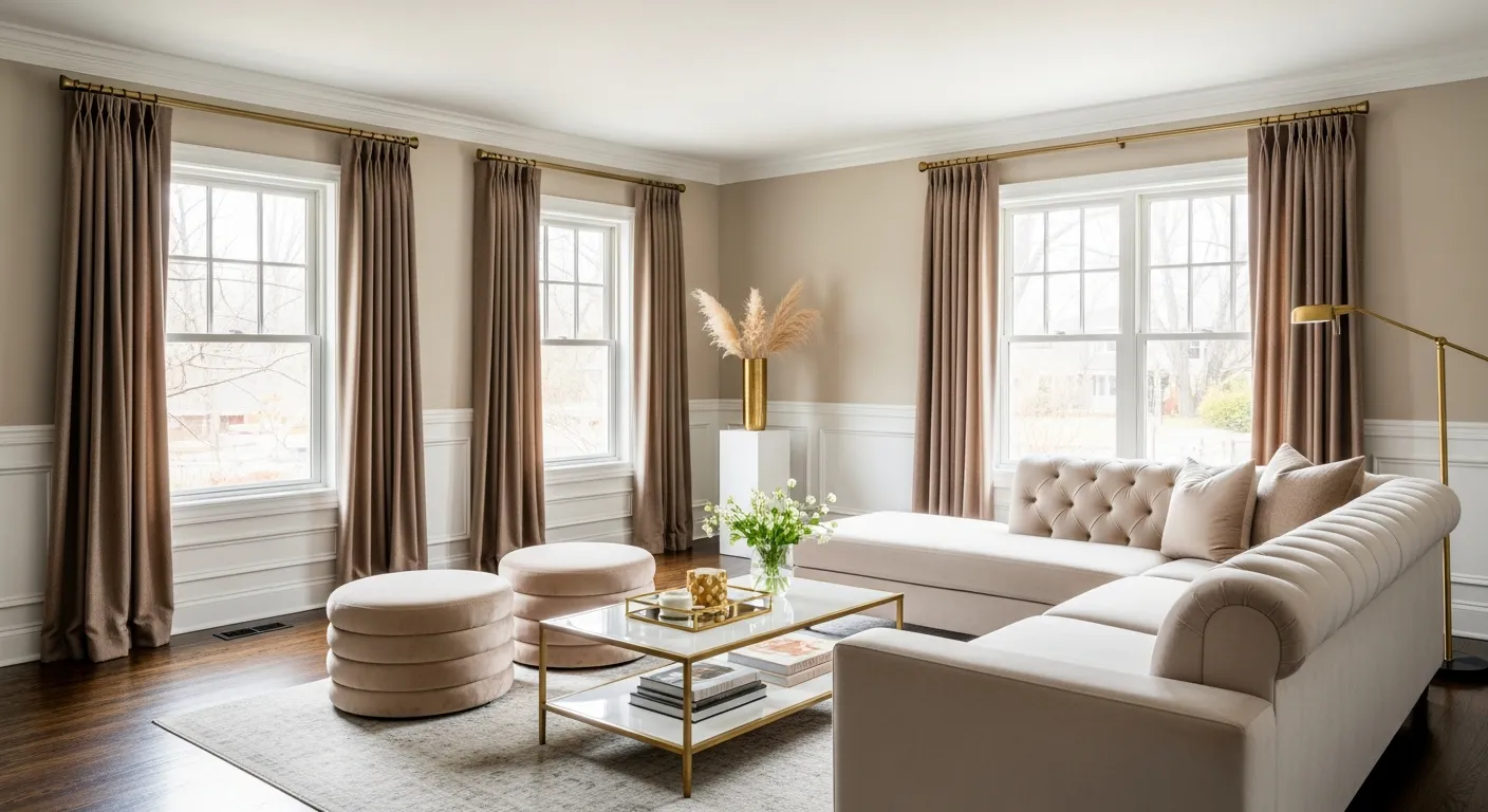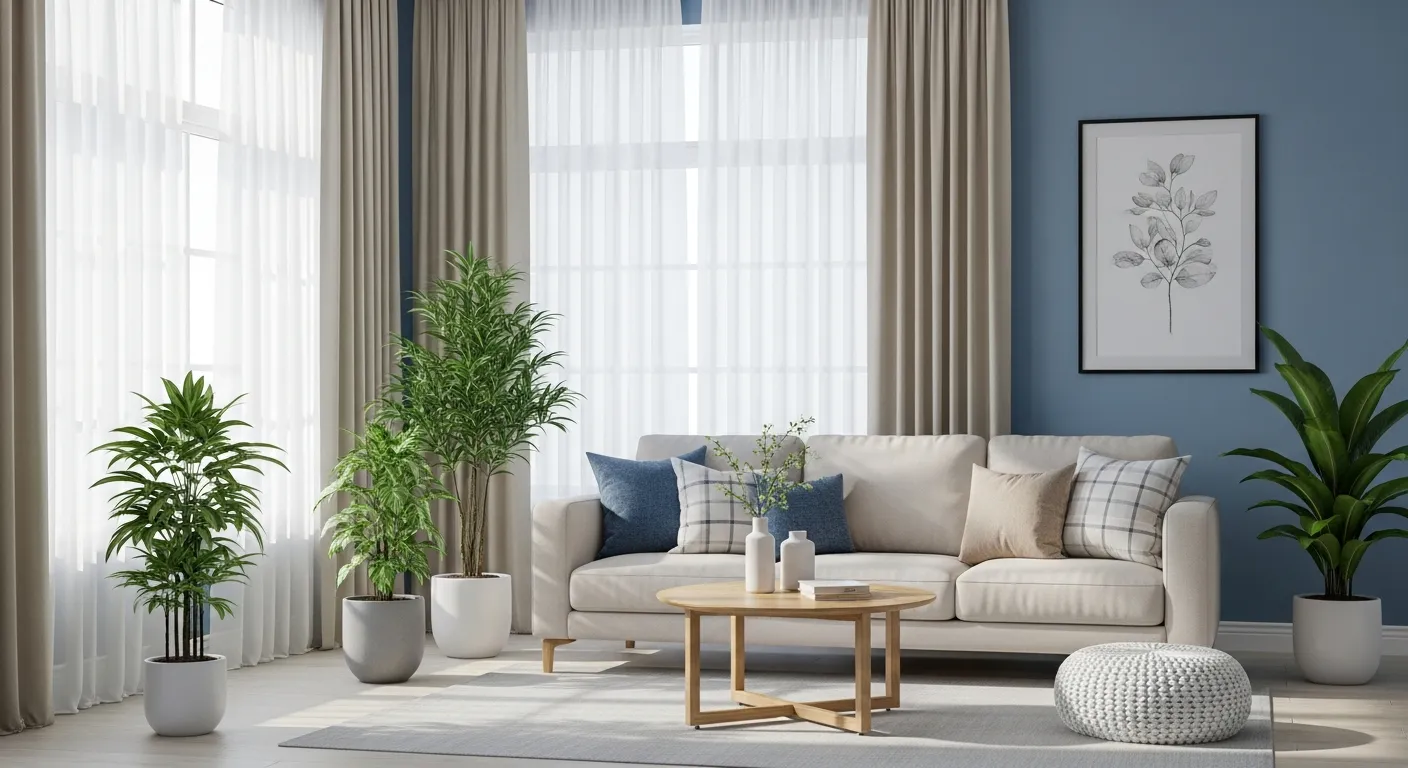

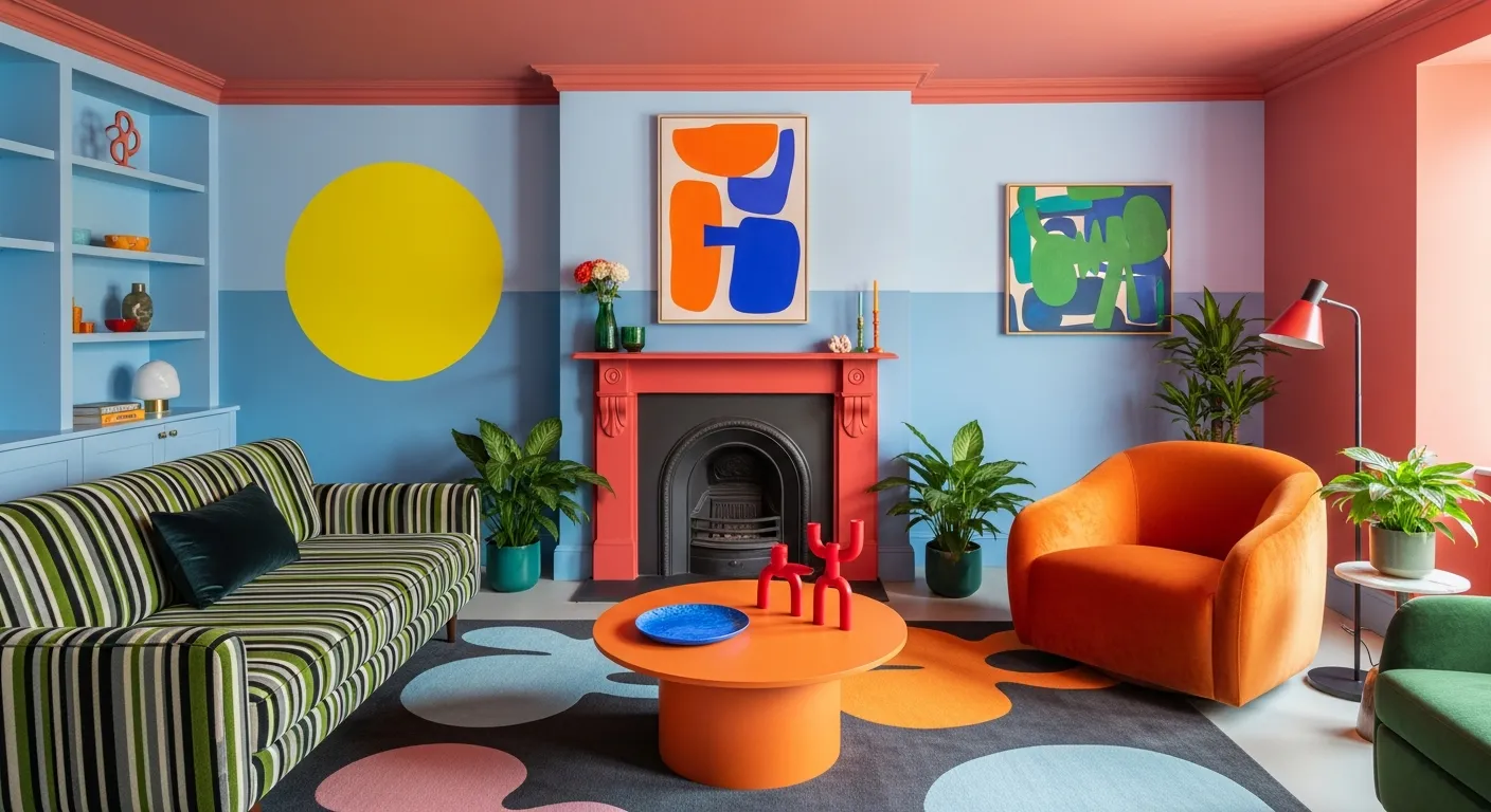
Choosing the right color scheme for your home may feel like a complicated job. You visualize a color palette in your mind and rush to the hardware store. Then you get the paint, apply it all over the wall, only to find that it doesn’t look flattering or completely off. Hence, it becomes important to visualize how colors would look on the walls, if it will complement the furniture, flooring, and the existing lighting.
The best thing is that there are several tools available online that can help you visualize color schemes for home decor. You can preview your ideas before spending a dime on paint.
What is Color Theory?
Color theory is how colors are processed and interpreted. It provides various color palettes, showing you exactly how much of each shade to use and where to apply them. It can be considered a baseline in understanding the color, as every person sees and interprets color differently.
There are three primary colors on a color wheel: blue, yellow, and red. All the other colors are derived from these primary colors, as when they are mixed together, they create green, orange, and purple. These newly derived colors are called secondary colors. Next, when you mix the secondary colors, it creates six tertiary colors, such as blue-green and red-orange.
If you add some white and black, it changes the shade, which creates different shades of each color. Black creates a slightly darker color, whereas white reduces the vibrancy. To understand the warm and cool tones, draw a straight line down the center of the color wheel. The color wheel also tells you that reds and greens can create complementary colors.
6 Ways to Visualize Color Schemes for Your Home
There’s no specific rule in choosing the color for your home. However, it is important to visualize the same, so that it puts together the entire space:
ColorSnap
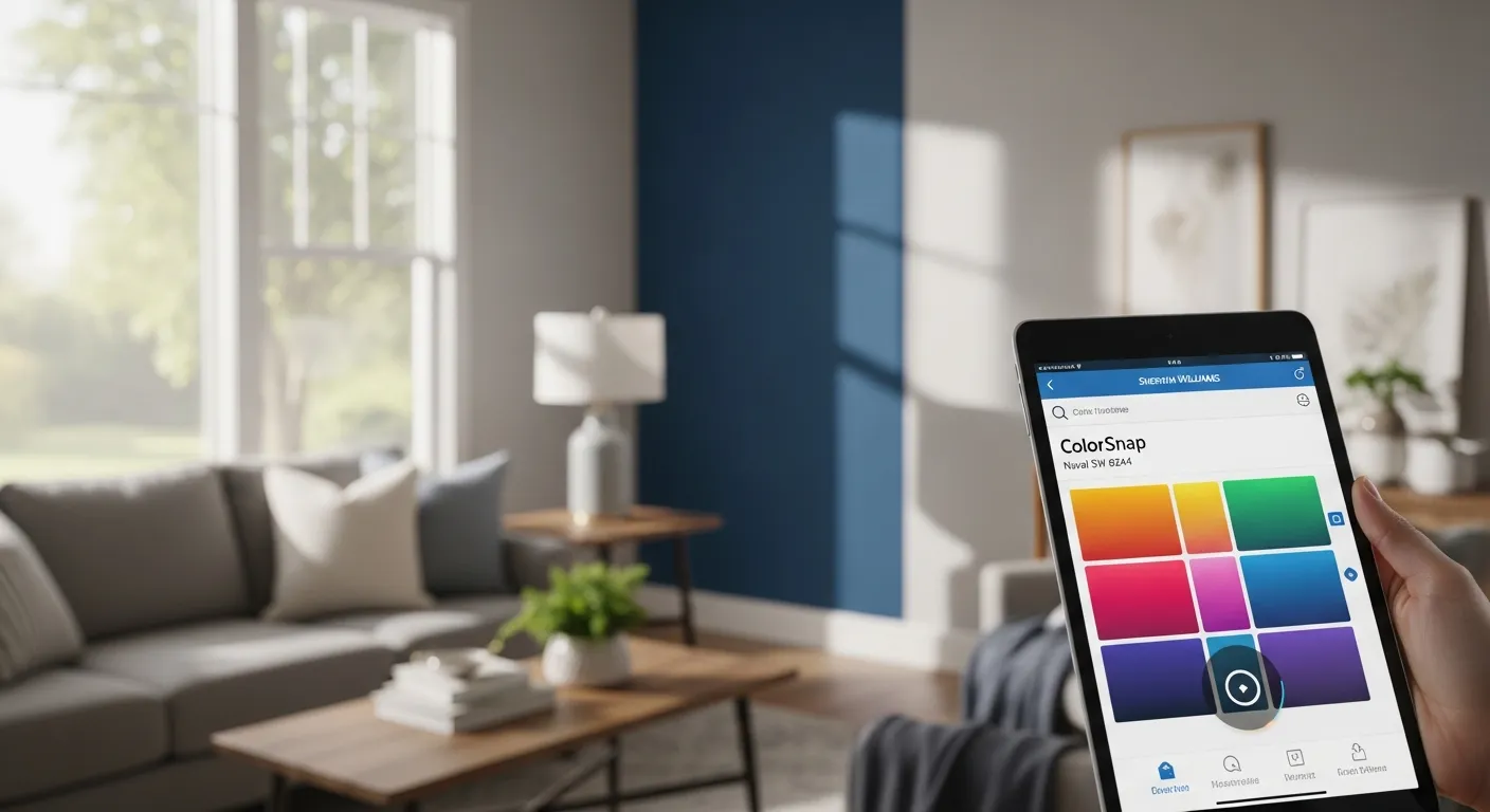
ColorSnap was created by Sherwin-Williams to help you build and visualize a palette for your home. Using the tool is absolutely easy, as you just need to create an account to upload a photo of the room as inspiration. Then, the tool will create a custom color palette with the specific Sherwin-Williams paint colors. You can also save your designs for future reference.
The best part is that you don’t have to limit yourself to the Sherwin-Williams paint. Even if you plan to buy paint from a local shop or a different brand, you can still use it to see how certain colors would look on the walls. You can also use the app to find a color you love (like a specific shade of blue), and then take the idea to any store to find a similar match.
Visualize Color
This is a user-friendly tool that is powered by Glidden Paints. It is easy to use, as you can simply upload a photo of the space or use a sample image that is already available on the tool. The Visualize Color tool allows you to paint the room virtually or create a customized color palette that specifically suits your room. It also enables you to save the color choices so that you can purchase that particular color at a local supply store.
Coolers.co

Coolers.co is the perfect tool for graphic designers and interior decorators. This is an easy-to-use website where you can upload an image of the room, pick an initial color, and find four more complementing colors to create a customized palette.
Once you finalize the design, you can save it for later to find those exact matches. The tool also has several features, and one of its best features is its ability to adjust saturation and view the colors in “color blindness” mode.
Canva
Canva allows you to upload the photo of a hotel room you stayed in during that “dream vacation” you took, and create a color palette. Since this tool isn’t associated with a specific company, you can play around with the palette as you like. Once you pick an image, the tools give you five colors that complement each other well.
ColorLovers
ColorLovers offers tools to create color palettes and patterns. Moreover, it is not just a tool; it is also a vast online community for design lovers with over 9 million users who contribute color ideals, palettes, and patterns. The platform has nearly 5 million user-generated color palettes. To see the user-generated color palette, check the “Home” tab. Plus, it has a free membership.
Paletton
You can start with one color and explore the wheel of possibilities. The tool has presets that allow you to randomize the colors and play around with the main color. It allows you to explore designs or generate palettes the moment you open the page. Once you find a combination of complementary shades you like, you can simply use a matching tool to find similar paint colors from any brand you prefer.
How to Choose the Perfect Color Palette for Your Home?
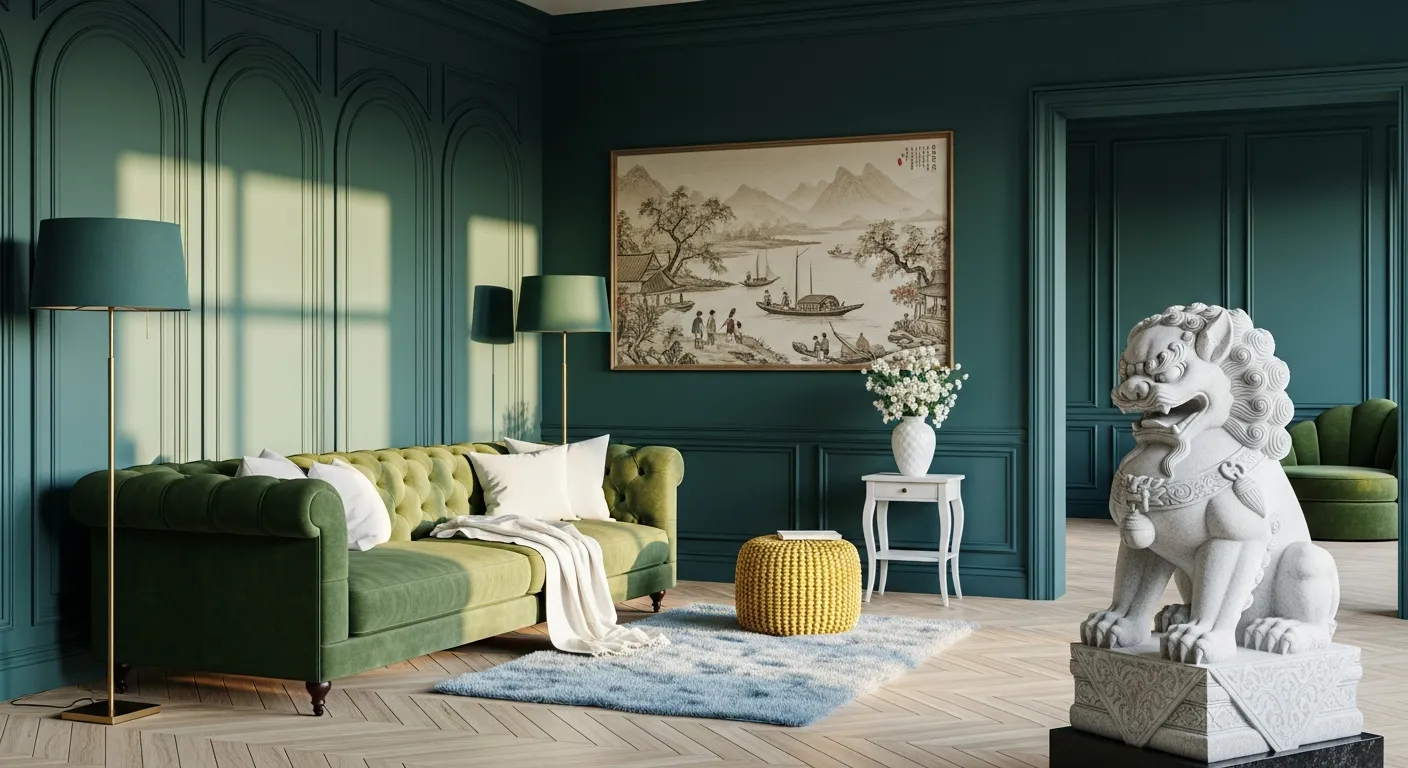
Though there are no rules on choosing the color palette, it should be done mindfully. Here are some tips to find the right color palette for your home:
- Choose the color you like to wear, always. This will work as a primary color.
- Next, add highlights and lowlights, but they should look natural and must have a little variance so that it looks richer.
- For a balanced look, combine both cool and warm tones, even if not in an equal manner. Check the color wheel, and you’ll find blues, greens, and purples to be cooler. Whereas, oranges, reds, browns, pinks, and yellows are more on a warmer side.
- Next, choose accent colors, and the best way to find an accent color is to pick a color opposite to the main color.
A Rule of Thumb: More color means more contrast, which can make the room look cluttered. To prevent this, start with a neutral paint color, add the focal color, and limit the accent color to the accessories only.